Kasrat Club
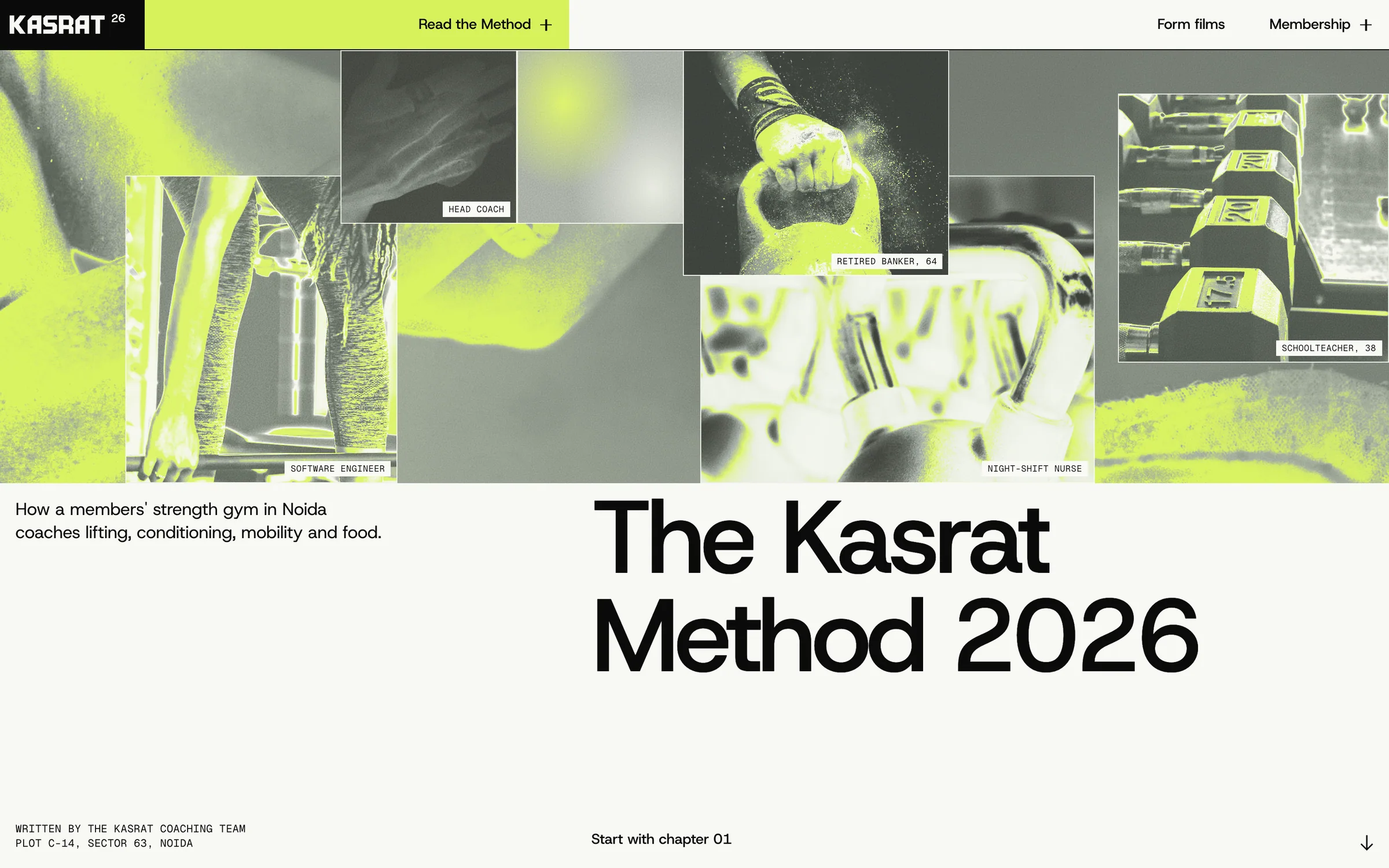
We treated a gym website like a printed research report: a Swiss grid, one chalk-lime chapter colour, and every rep explained in the open.
Kasrat Club is an invented members' strength gym in Sector 63, Noida. Its idea is simple: write the coaching method down and give it away. Strength, conditioning, mobility and food each get a chapter, so a new member can read exactly why each set is on the board before they ever touch a bar.
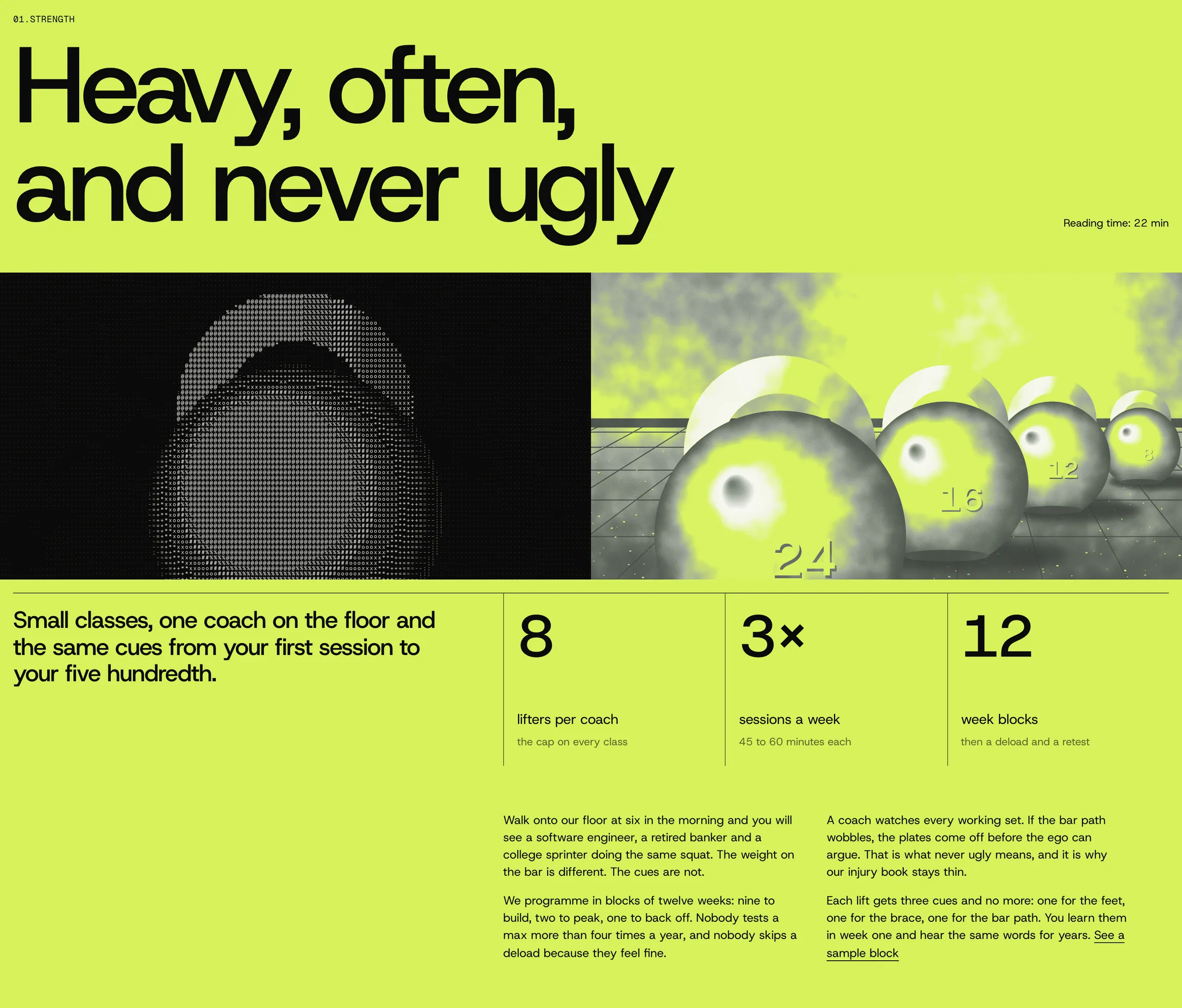
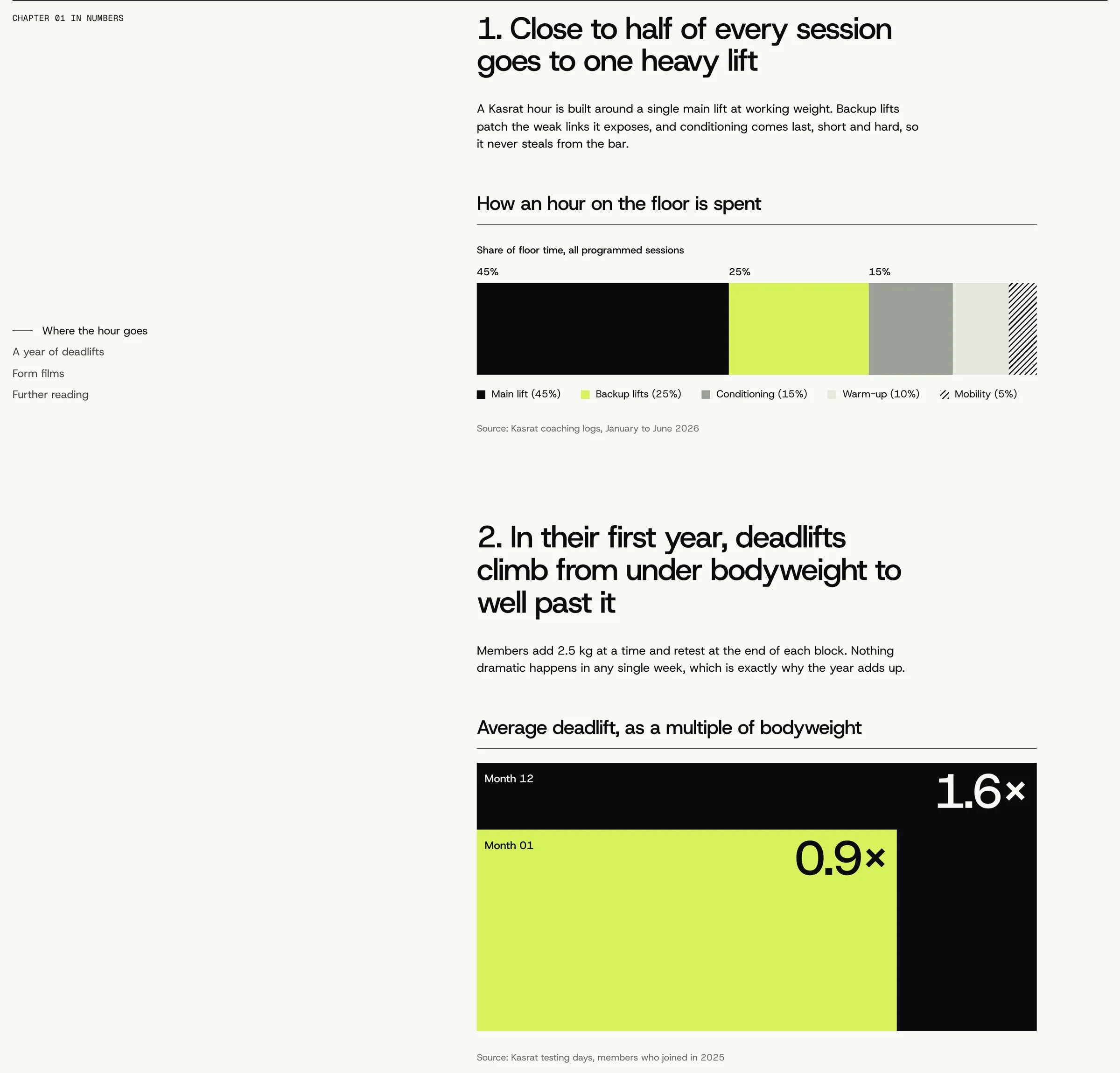
That idea asked for an editorial system, not a fitness template. Every section hangs off one vertical line at 42 per cent of the width: a mono label on the left, headings and copy on the right, a hairline rule opening each block. Chapter pages flood the screen in chalk lime against near-black and warm off-white, and session data is set as real charts, a stacked bar and an area-proportional block chart, the way a coach would lay out a training log.
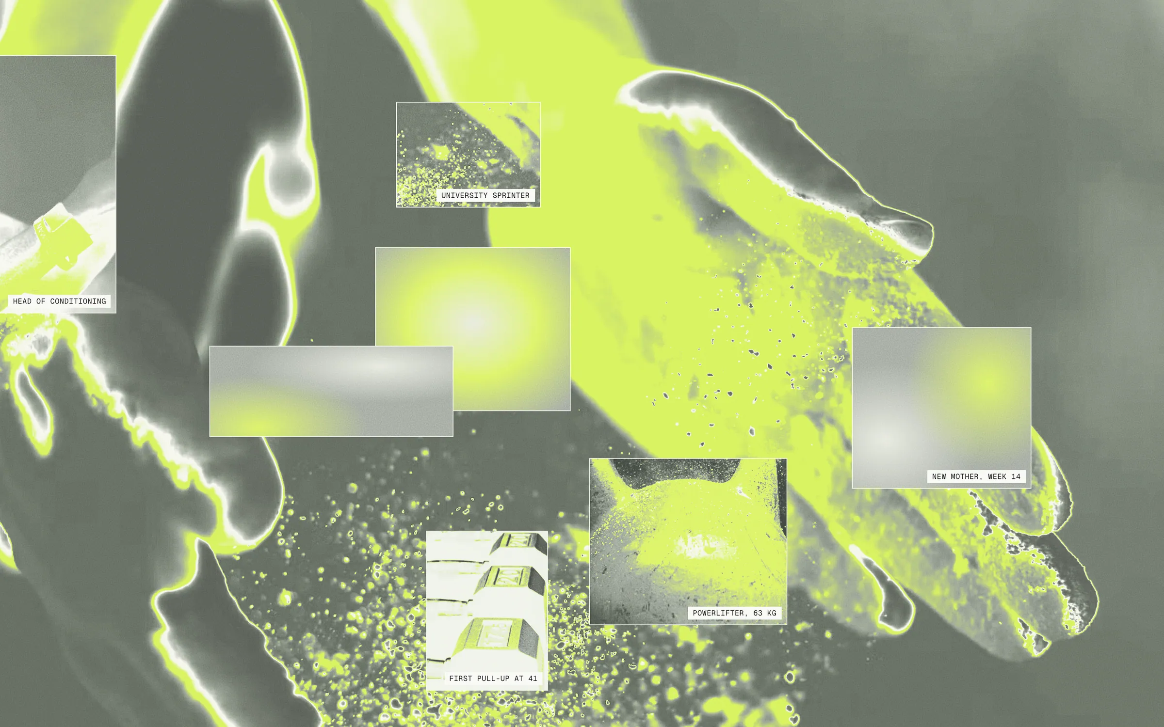
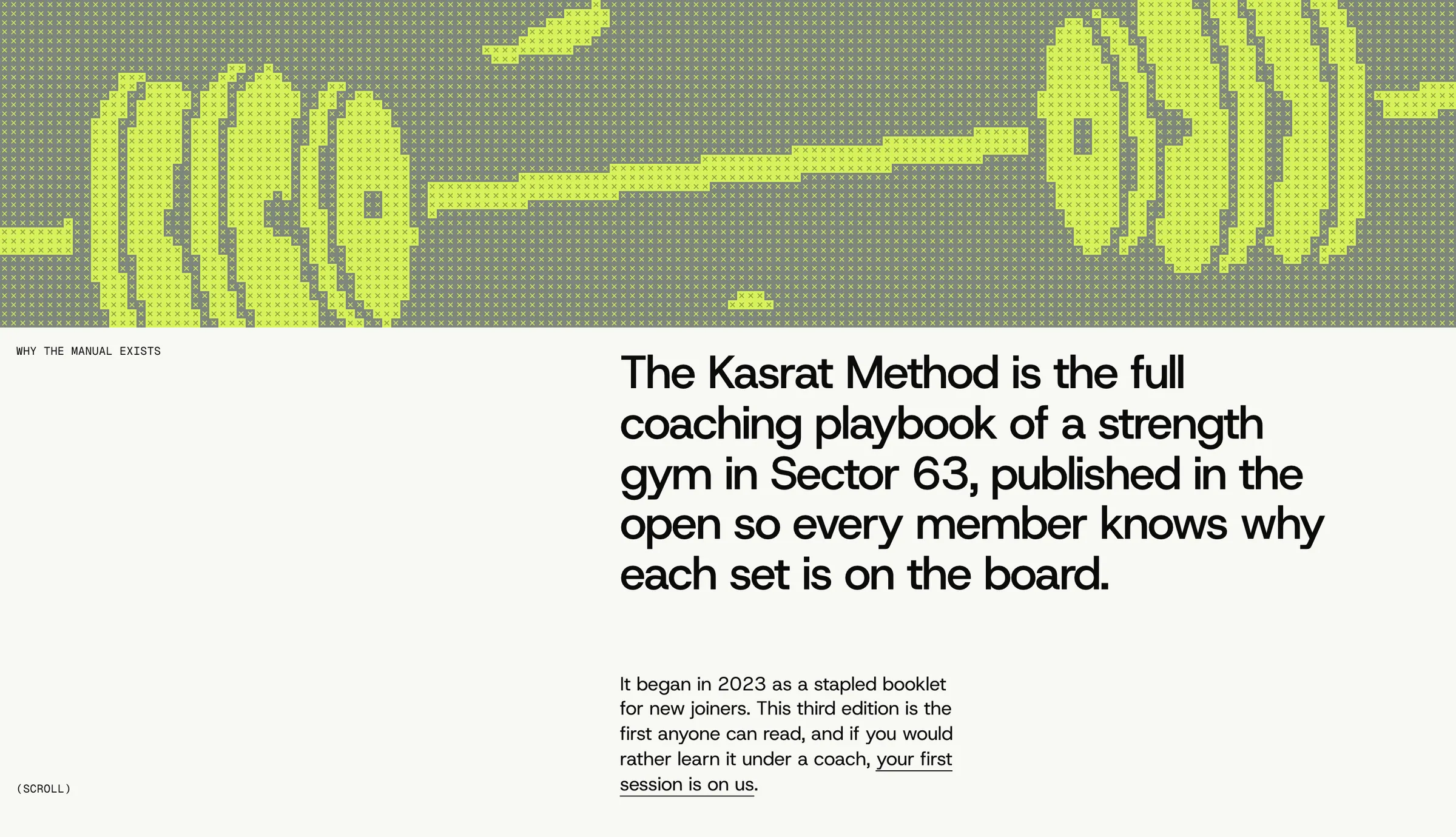
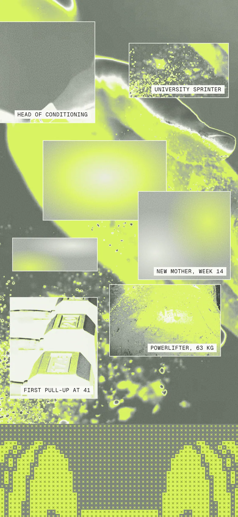
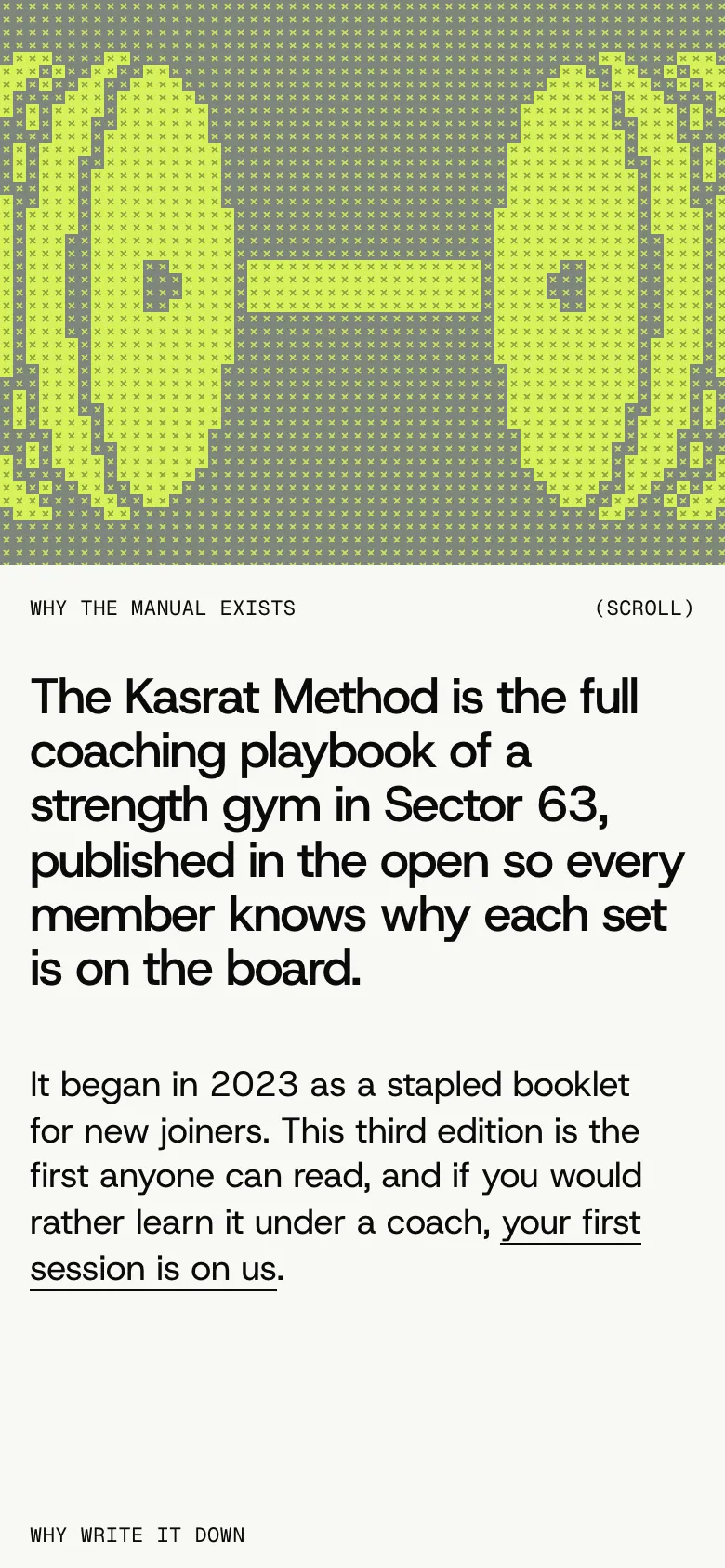
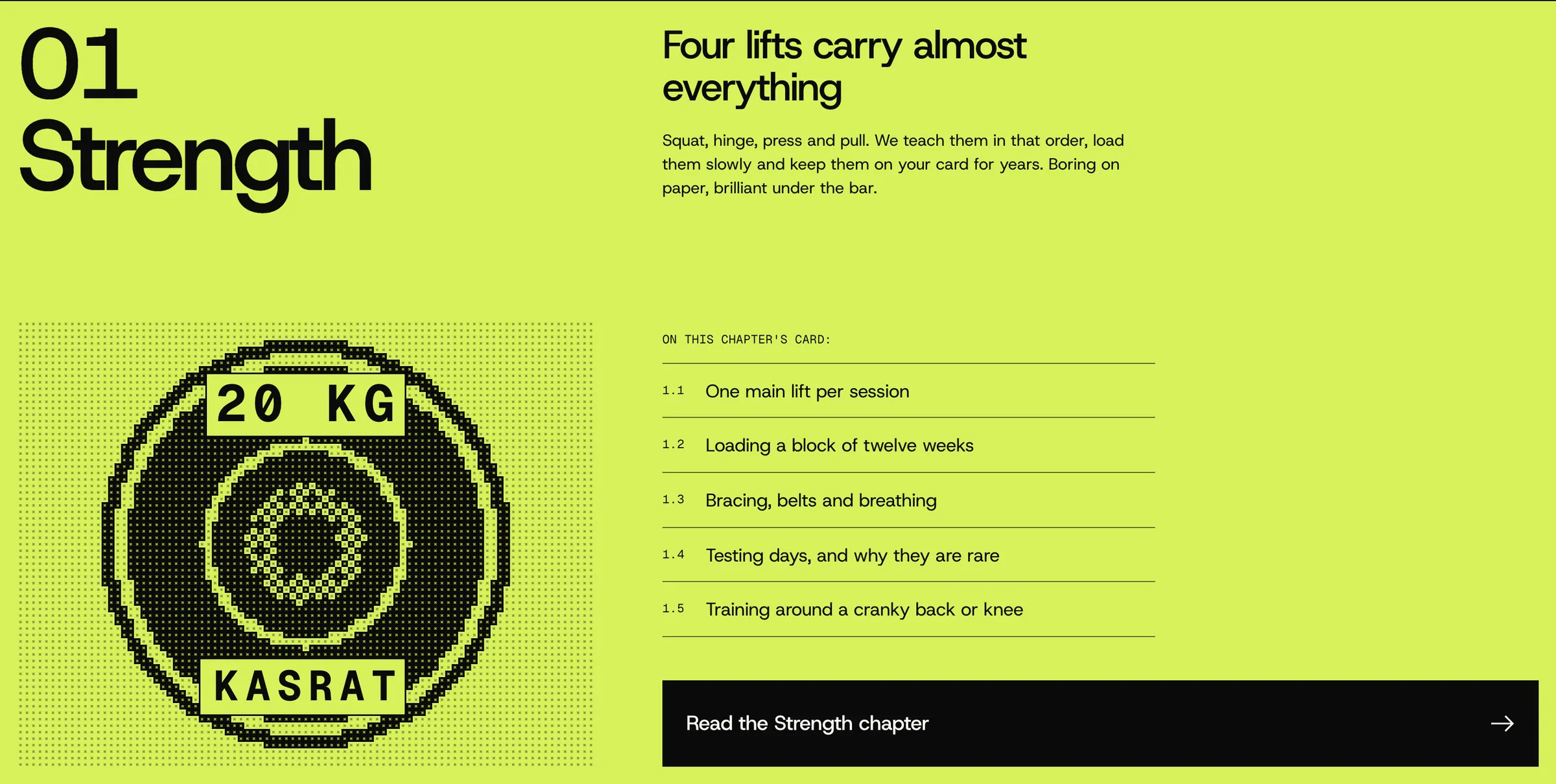
Photography is graded through SVG gradient maps: the collages go solarised lime and concrete, cut into captioned tiles tagged with members' day jobs, and the film stills go ink-dark with chalk-lime highlights. The rest of the imagery is drawn in code: a canvas cross-stitch of a loaded barbell, a dithered 20 kg bumper plate and an ASCII kettlebell. Collage tiles drift on scroll, the hero headline rises word by word, chart bars grow into place and stats count up, and the layout folds to a single column with a full-screen menu below 860px.
- Landing page
- Logo and wordmark
- Editorial grid system
- Data chart styles
- Generative textures
- Motion
- 11-section landing page built on a single 42 per cent content line
- Drawn stencil wordmark in the style of stamped iron plates
- Three canvas textures: cross-stitch barbell, dithered plate, ASCII kettlebell
- Eight photographs regraded through SVG gradient maps into the club palette
- Responsive from 360px with a full-screen mobile menu
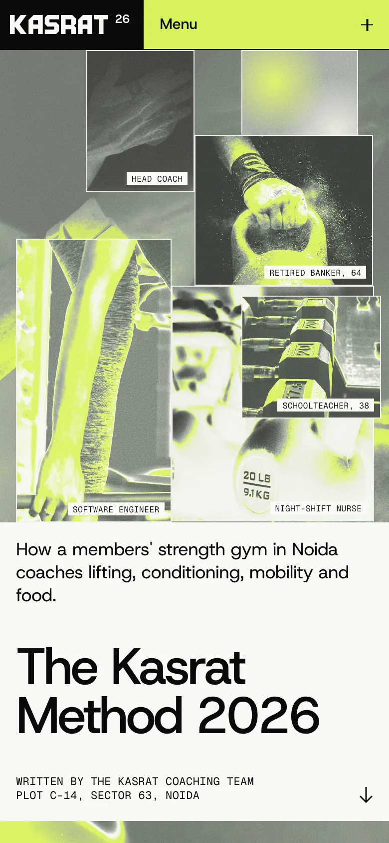
Every section of the homepage, top to bottom, exactly as built.

dabba_