dabba_
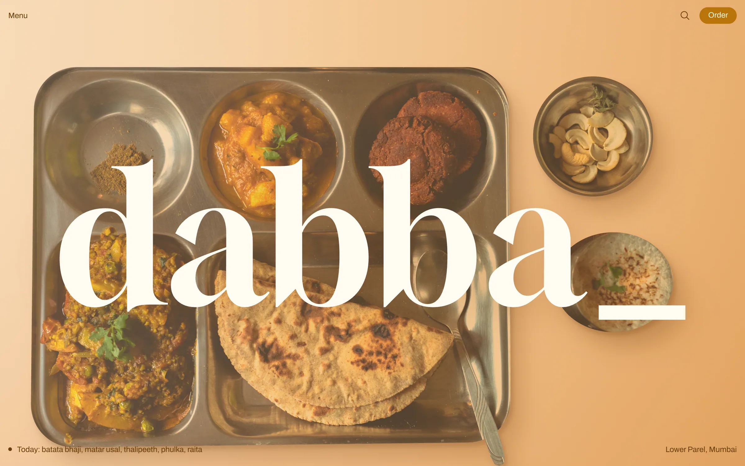
One colour, one underscore, one dabba. We gave a plastic-free lunch kitchen a turmeric identity strict enough to read as a stamp, and an ordering site built around the returning tiffin.
dabba_ is an invented Mumbai cloud kitchen with one rule: lunch leaves in a three-tier steel tiffin, and the rider collects yesterday's empty when the next one arrives. It answers a problem anyone who eats at a desk in Lower Parel or BKC knows well, where every delivered meal comes in a plastic tub, a foil tray and a paper bag.
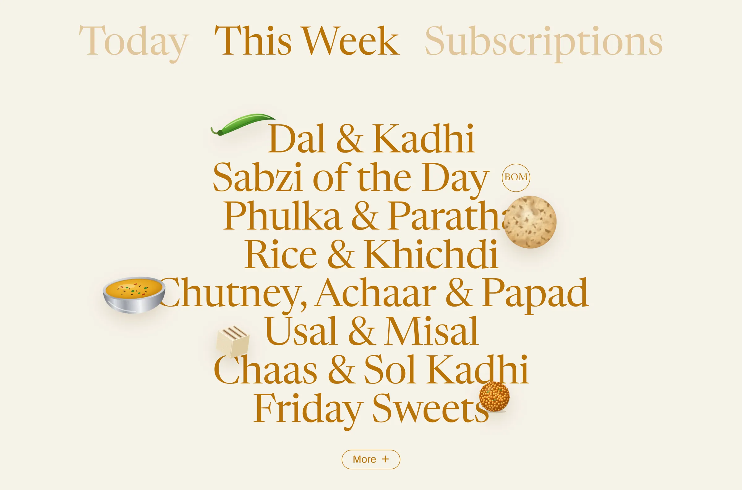
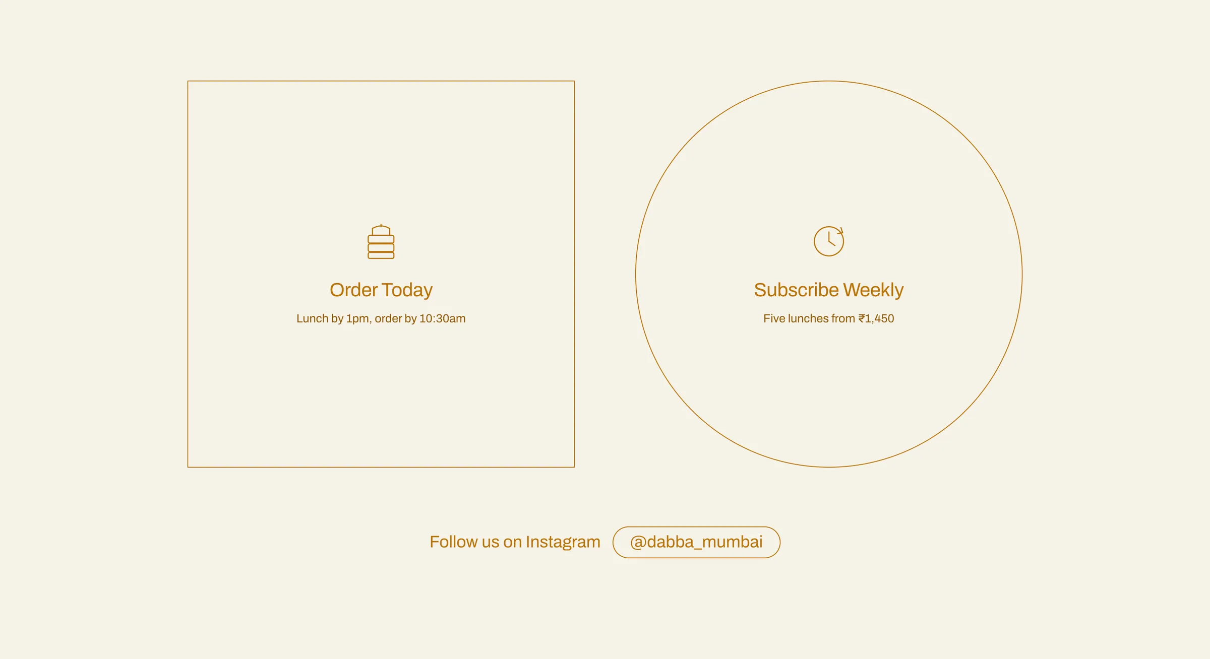
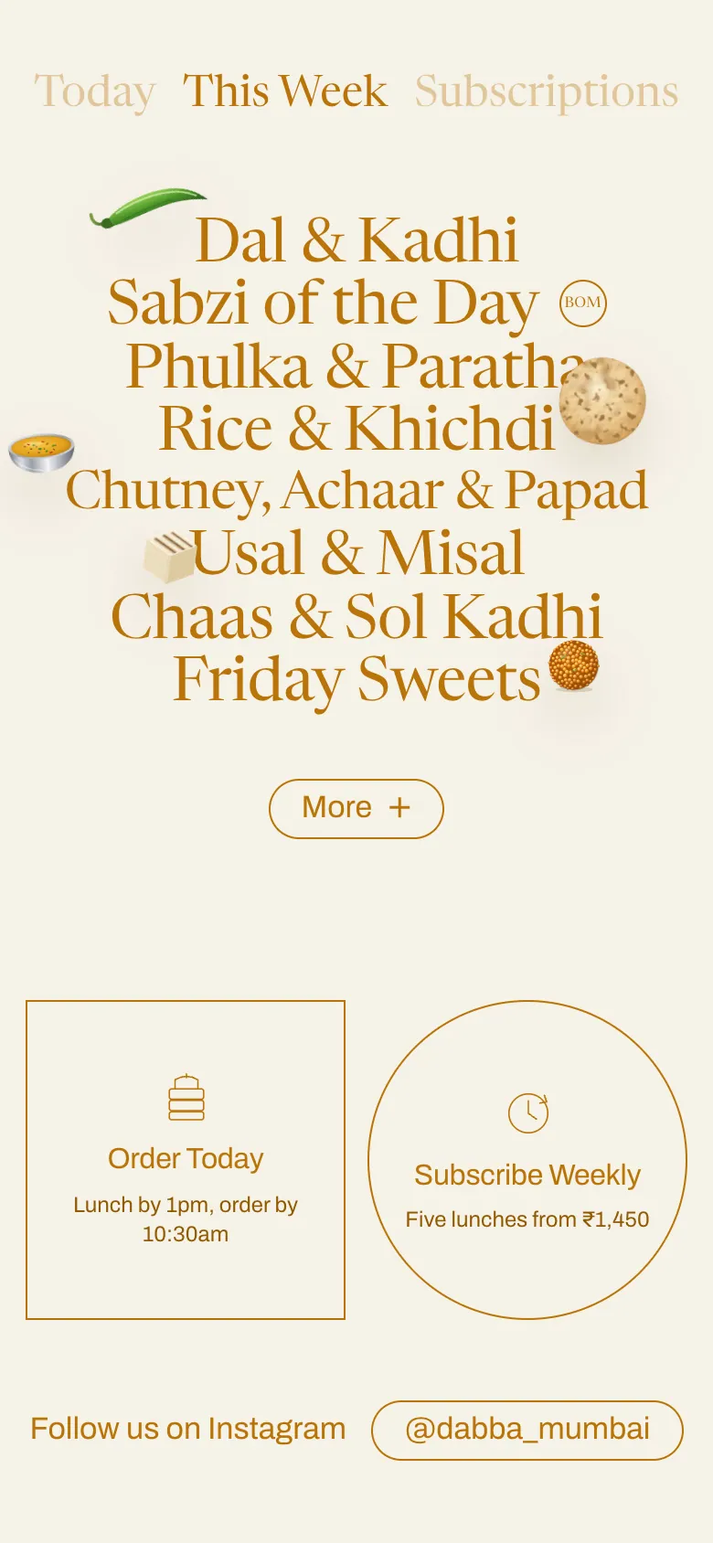
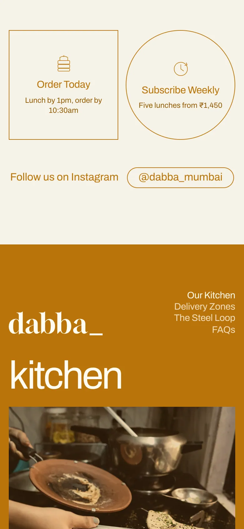
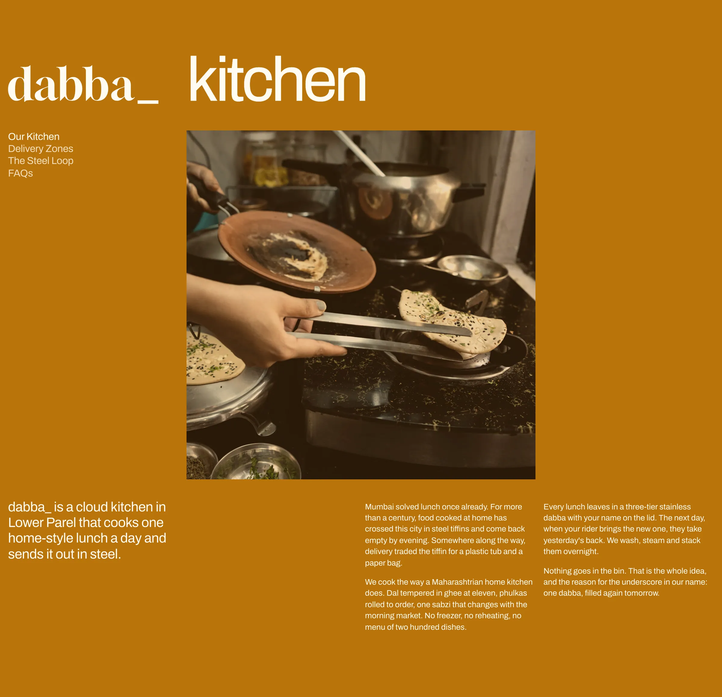
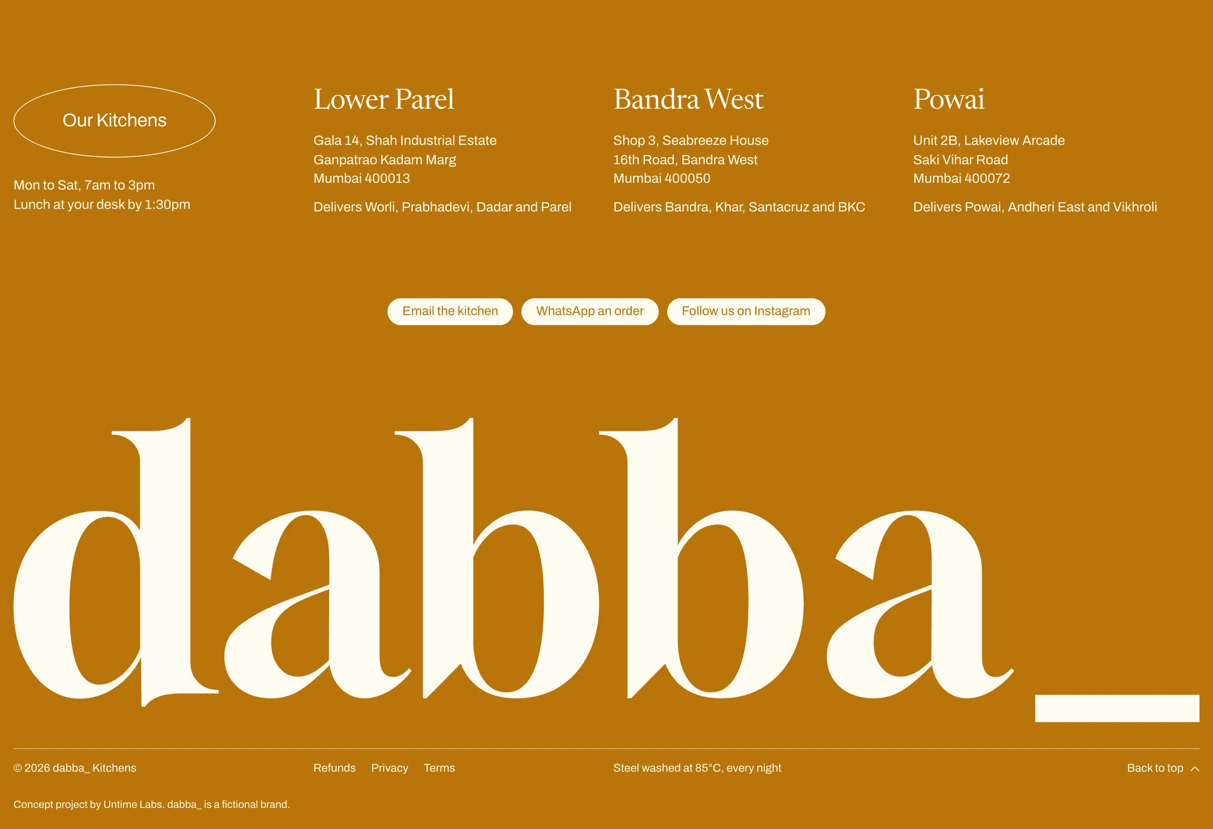
We gave it a strict one-colour language: turmeric ochre on warm paper, inverting to a full ochre field on the story pages, with no second accent anywhere. The wordmark is a high-contrast serif followed by a thick underscore, a fill-in-the-blank mark that scales from the nav to an 84vw hero, set over a cut-out steel lunch tray on a peach-to-amber paper ground. A quiet serif tab row (Today, This Week, Subscriptions) leads into category names stacked in a display serif, with drawn food objects (a green chilli, a katori of dal, a phulka, a cube of paneer, a boondi ladoo) floating over the letters. The two ways to order become giant hairline shapes: a square for today, a circle for a weekly plan.
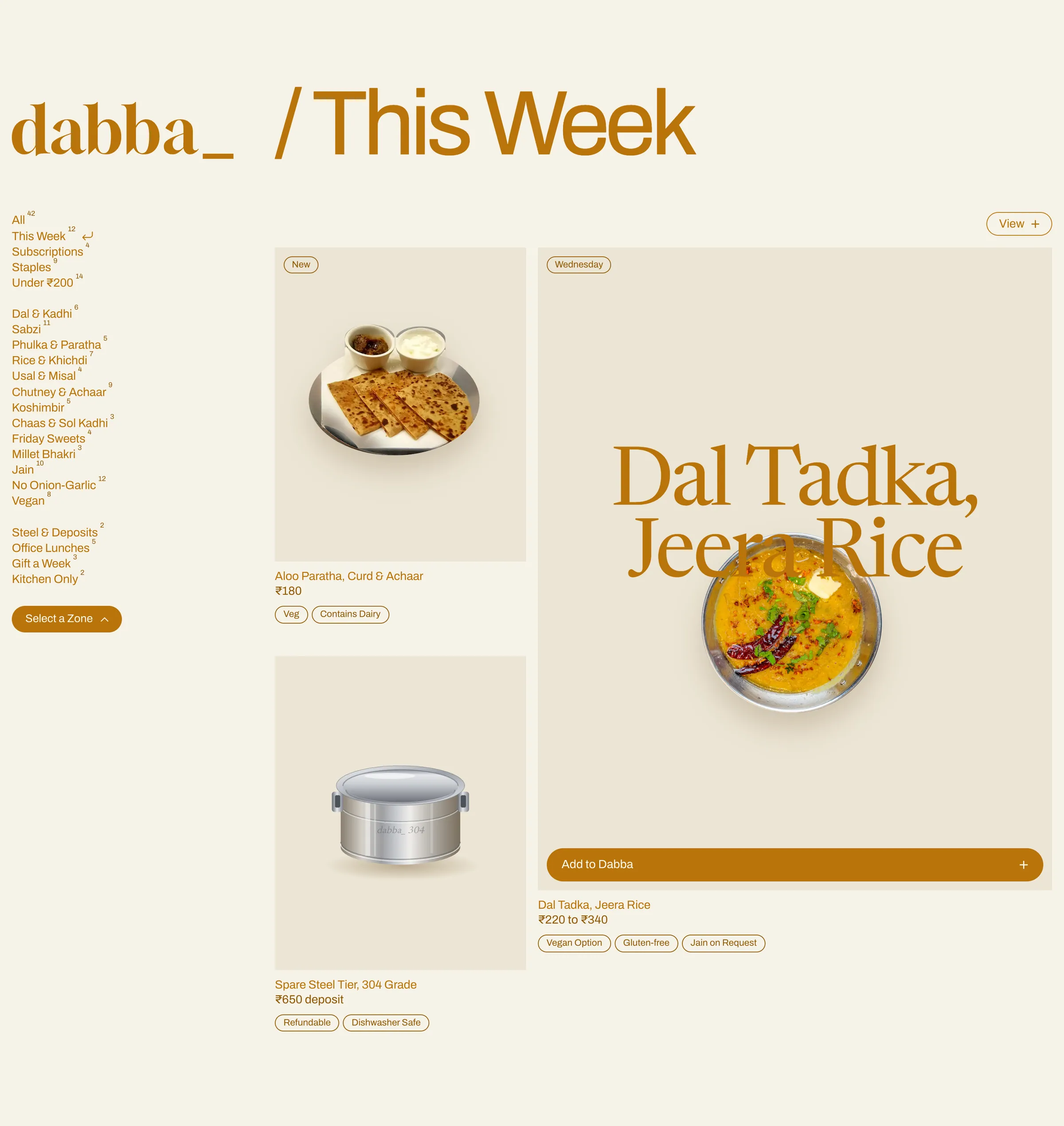
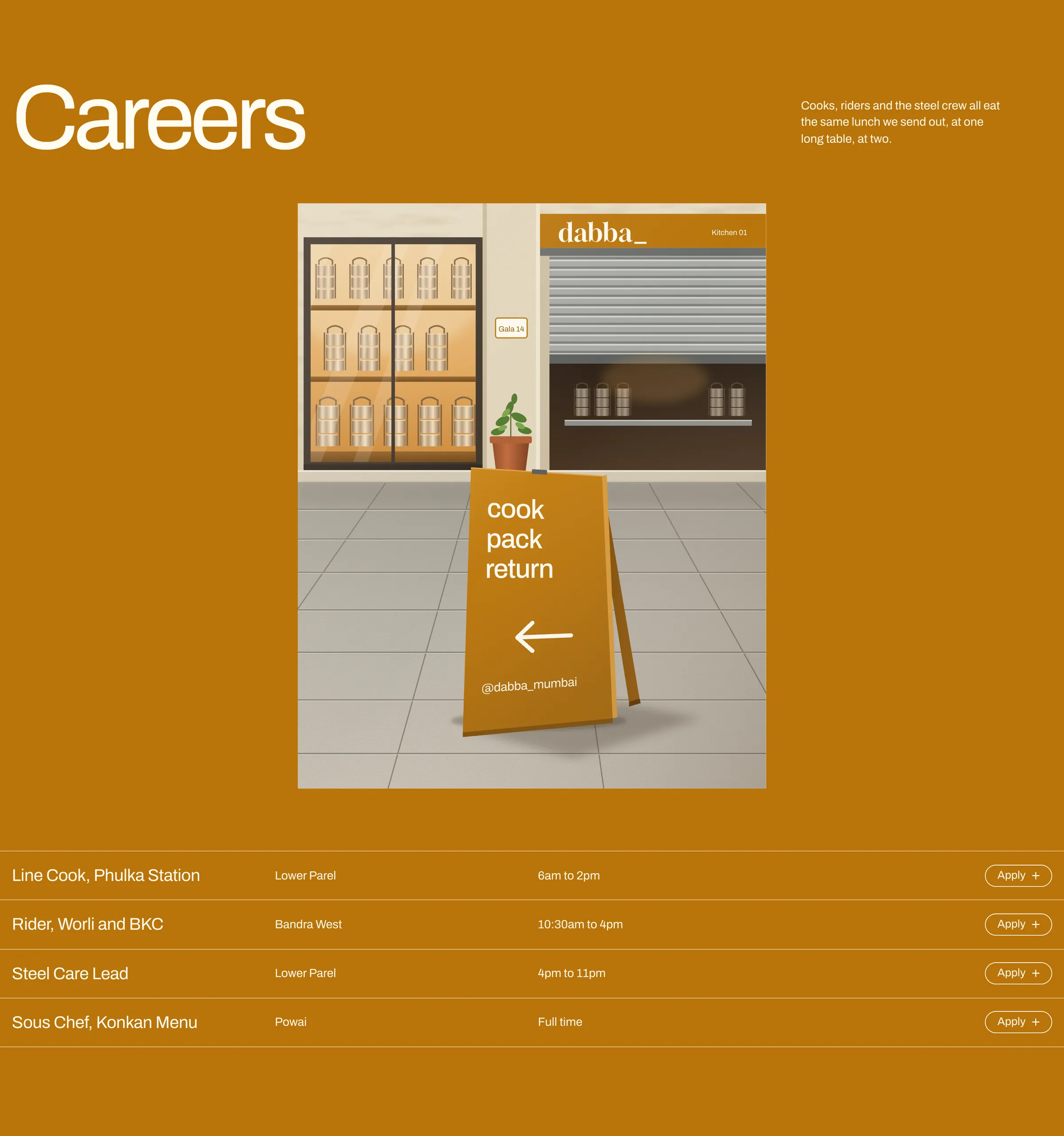
The page runs on a four-column grid with 16px margins. Column one is a constant spine for the logo, sub-navigation, filters and the kitchen list, and page titles start at column two on the logo's baseline. The shop uses superscript counts, a return-arrow active marker and a feature card with the dish name set over a clipped cut-out photo, beside a drawn steel tier. Careers trades a photo for a drawn street scene: an ochre sandwich board reading cook, pack, return outside the kitchen shutter. Motion stays quiet: the wordmark letters rise in, the underscore draws and blinks like a cursor, the food objects bob slowly and a dot travels the steel-loop diagram. On mobile the filters turn into a scrolling pill row and the two order shapes sit side by side.
- Landing page
- Logo and wordmark
- One-colour brand system
- Shop and ordering UI
- Food and street illustration set
- Motion
- 8-section landing page with a full-screen menu, responsive to 360px
- Wordmark drawn as SVG outlines with a separate underscore bar
- Hand-built SVG food objects, steel tier and a drawn careers street scene
- Shop grid with filters, a zone picker and a working add-to-dabba count
- Four graded photographs, everything else drawn in code
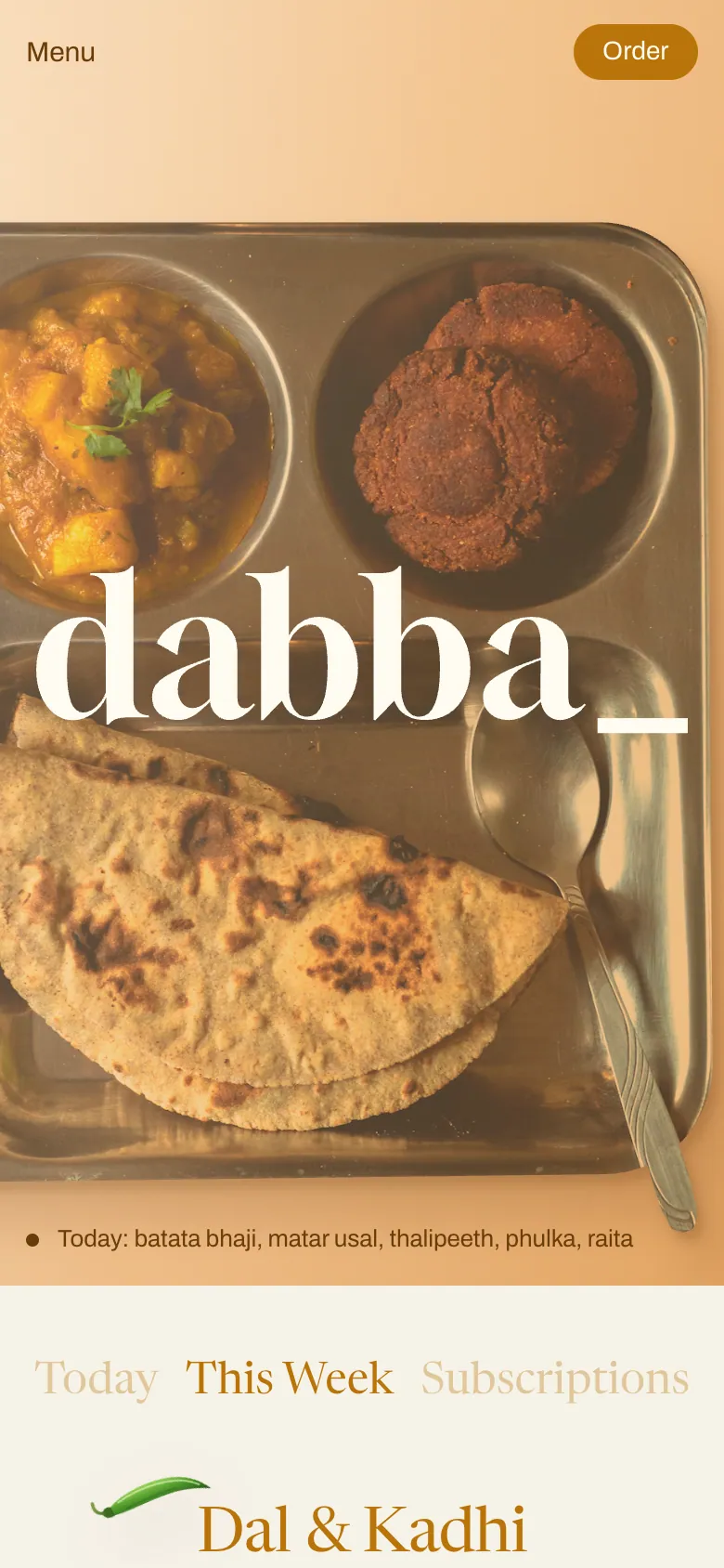
Every section of the homepage, top to bottom, exactly as built.

Studio Kaath