Studio Kaath
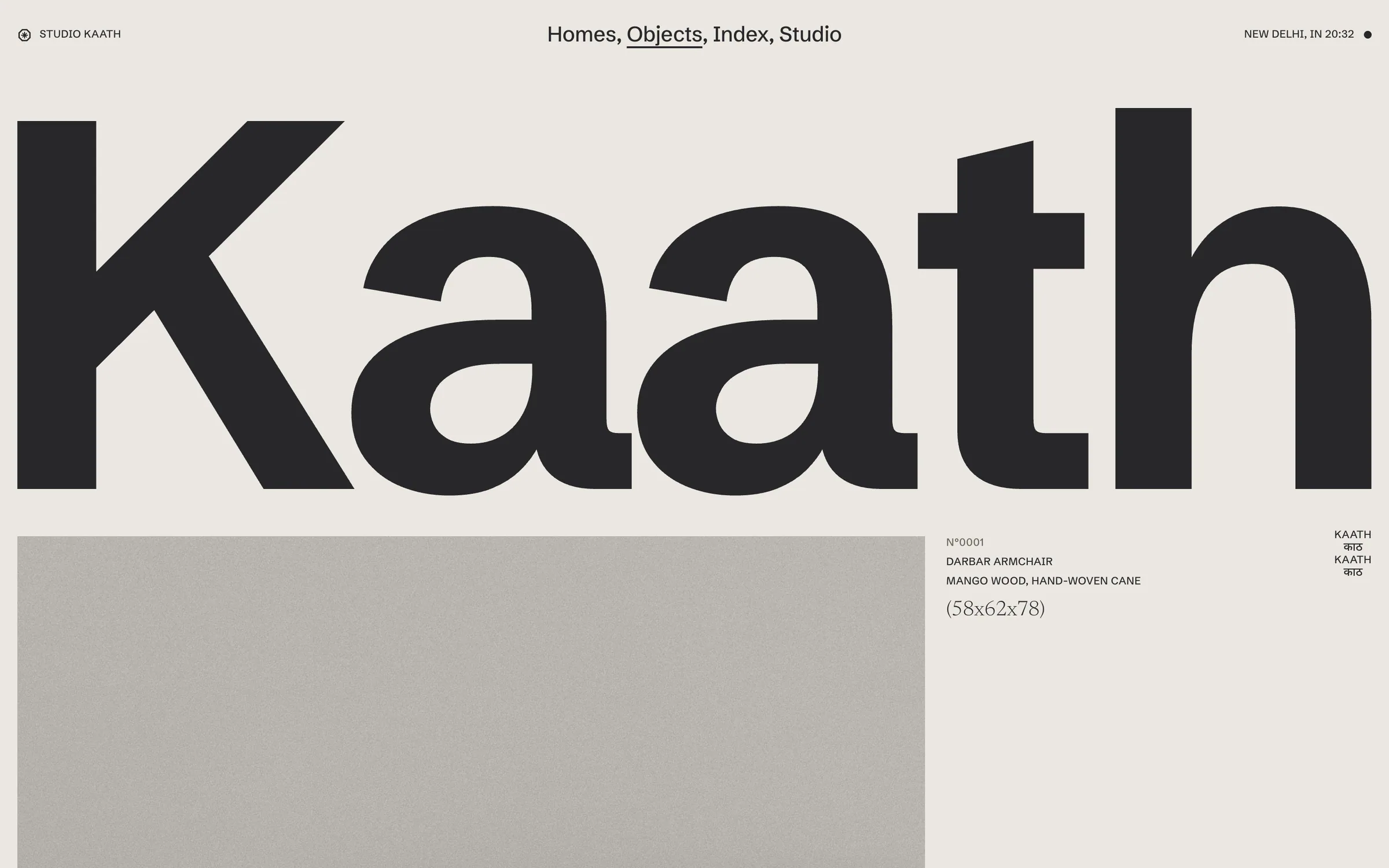
We treated a design studio's website like a museum's object register: one giant wordmark, a numbered index, and photographs graded to the quiet grey of an old catalogue plate.
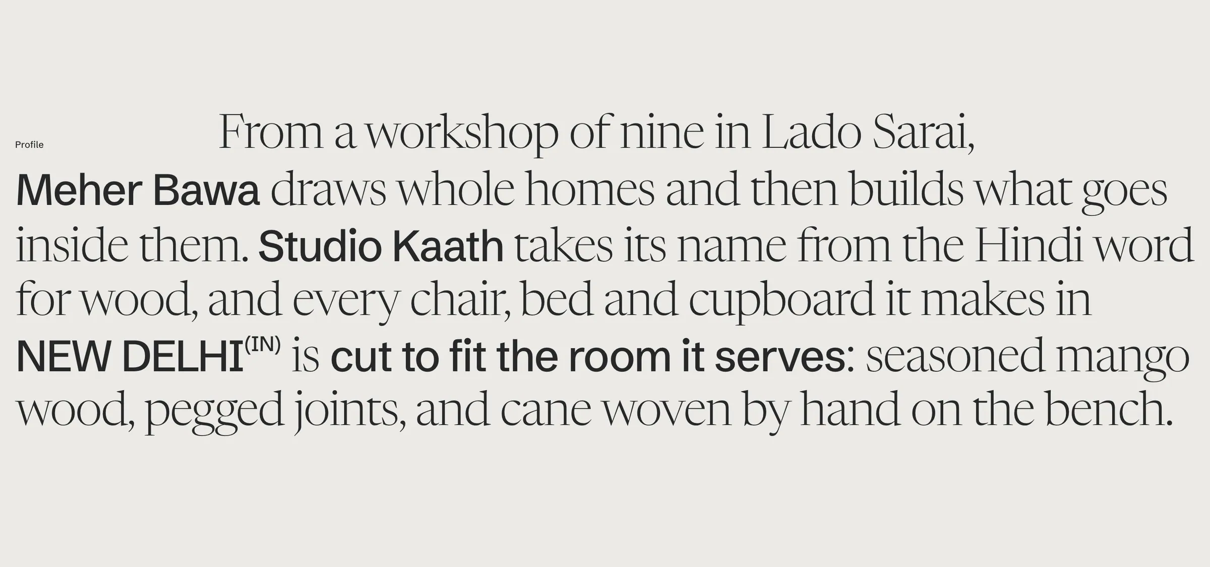
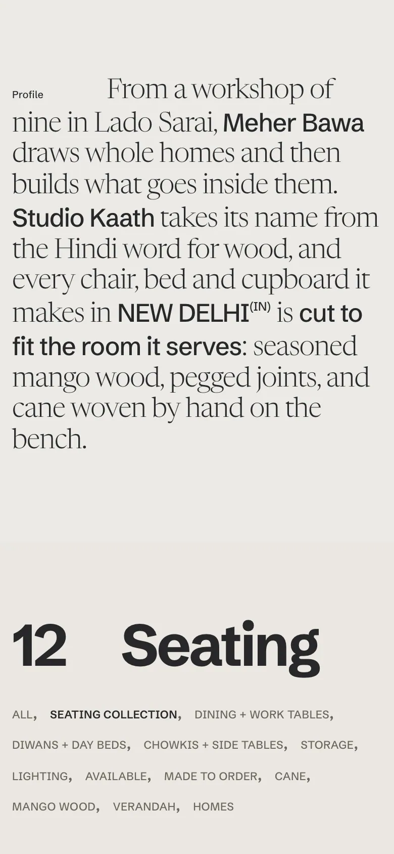
Studio Kaath is an invented New Delhi practice that designs whole homes and builds the furniture inside them, in mango wood and hand-woven cane, from a workshop in Lado Sarai. Small studios like this usually end up with a portfolio grid that flattens rooms and objects into the same tile. We wanted a slow, craft-led practice to read with the authority of an archive instead.
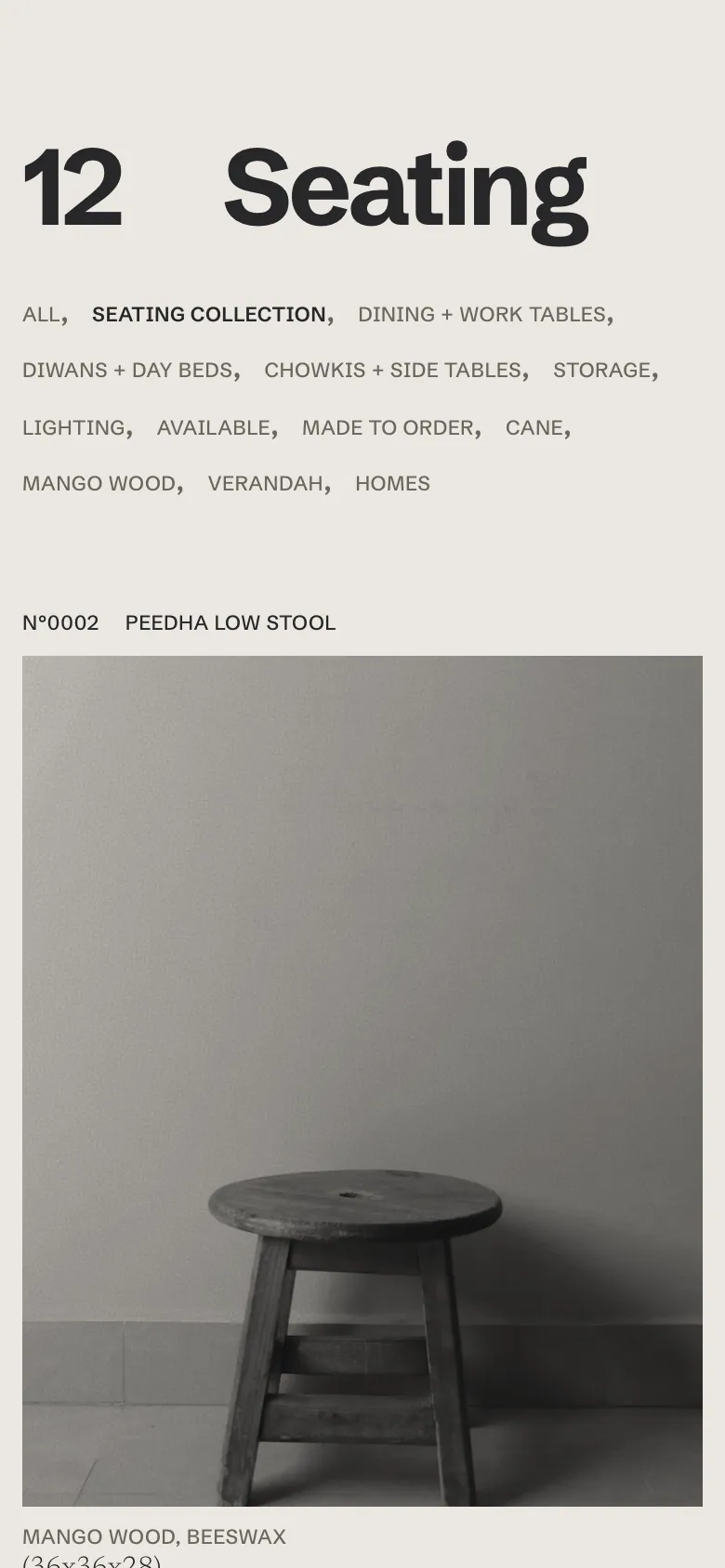
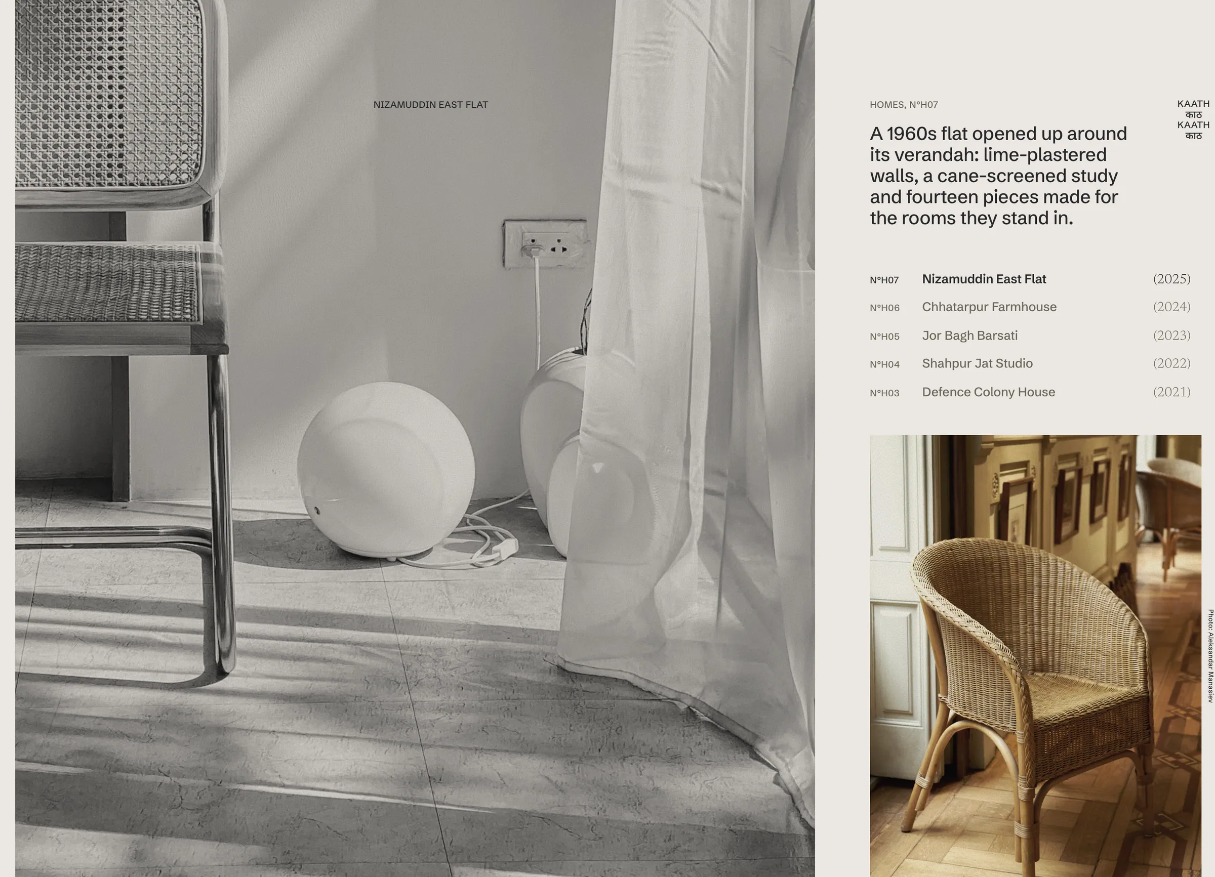
The page runs on one bone background with near-black ink, and the only colour comes from wood and cane inside the imagery. A heavy grotesk wordmark, Kaath (Hindi for wood), fills the viewport edge to edge at the top and again at the foot. Type works in three voices: Schibsted Grotesk for names and navigation, a light Newsreader for connective text and for dimensions in parentheses, and 11px capitals for catalogue numbers. Most photographs are desaturated and tinted to the grey of a studio backdrop, so rooms and stools sit together like plates in one catalogue; one colour plate per section carries the warmth of the wood. A small vertical mark stacks the Latin name with its Devanagari spelling on the right edge.
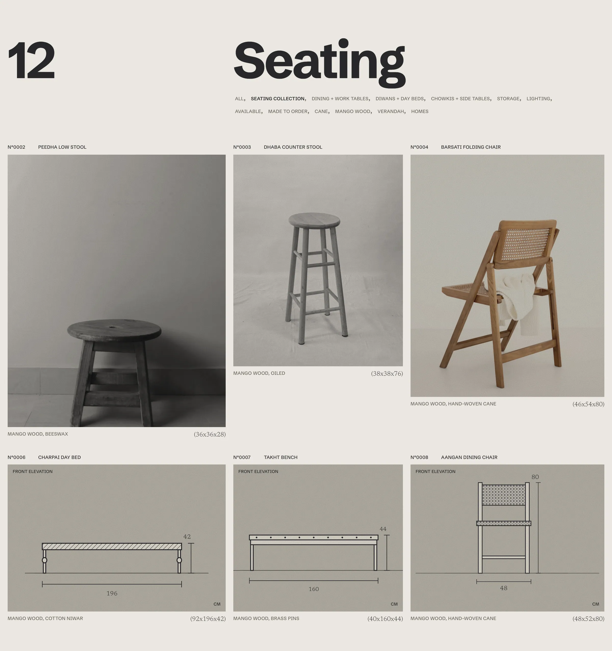
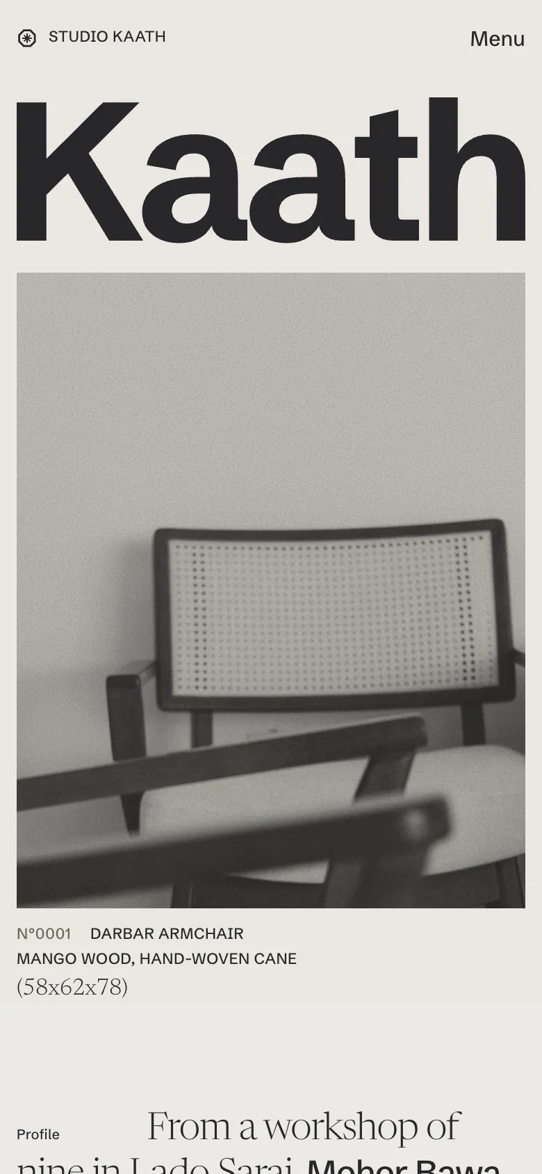
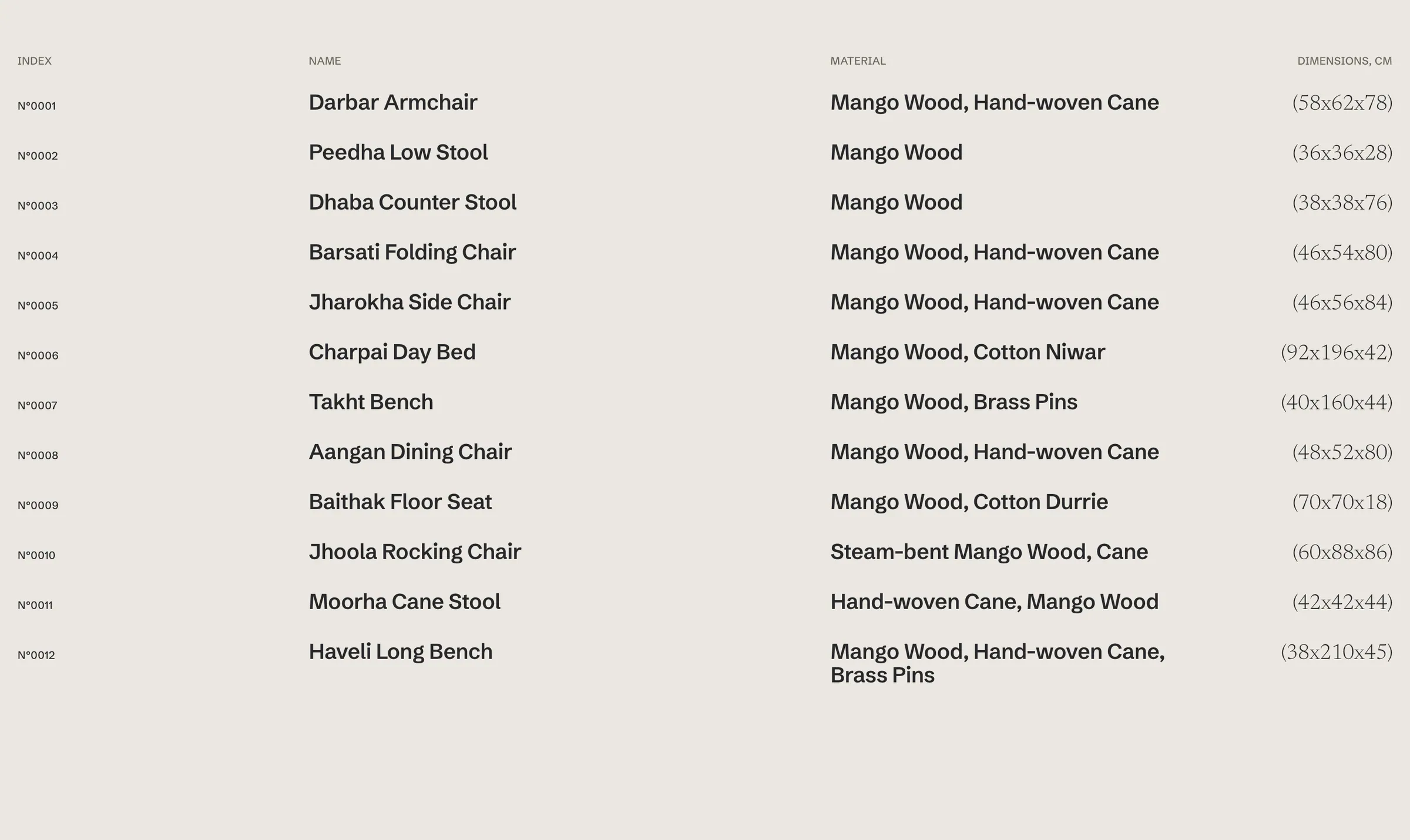
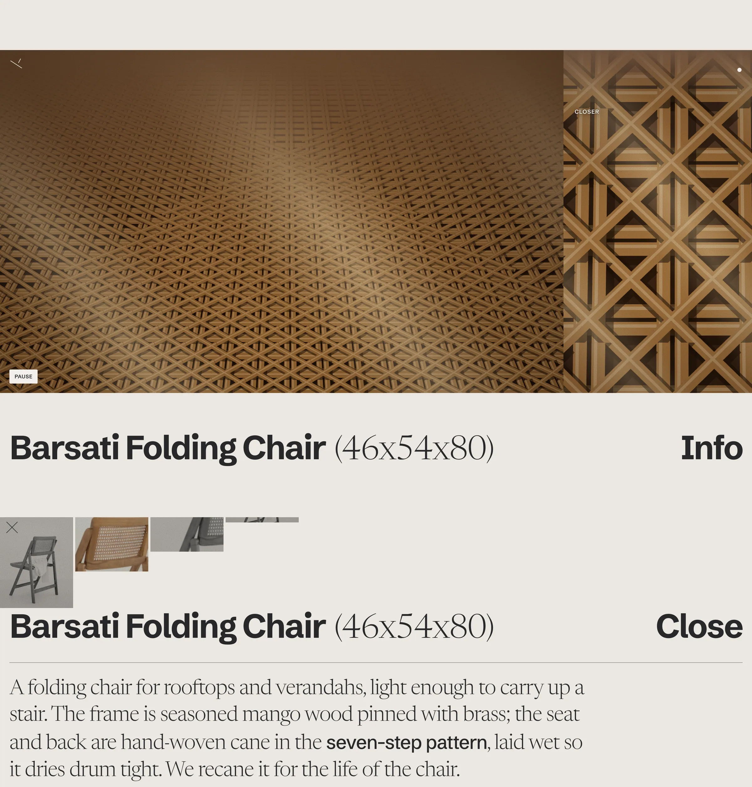
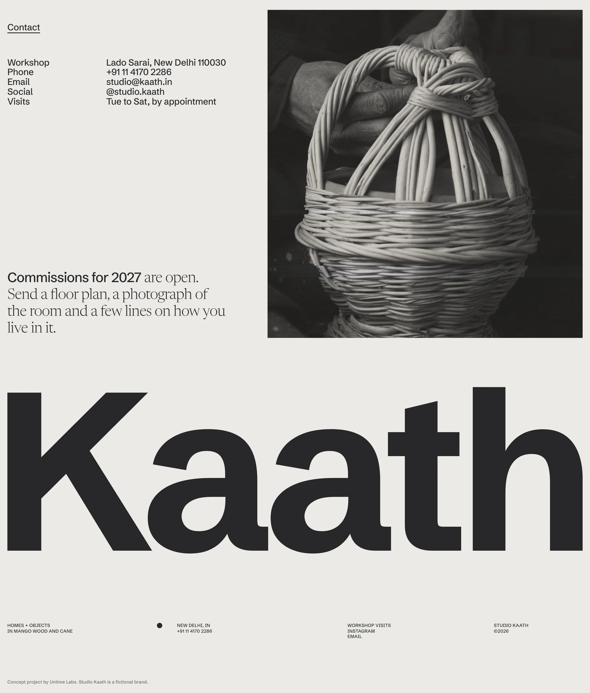
The landing page follows eleven beats: an intro curtain, the wordmark hero, a profile paragraph that switches between sans and serif mid-sentence, a category header with working filters, an uneven three-column object grid that pairs photographs with drawn front elevations, a ruleless twelve-row index, a homes split with a colour inset, a film stage, an opened info entry, contact and the bookend footer. The film is a canvas render of seven-step cane drawn in true perspective with sunlight drifting across it, and it pauses on request. The same code-drawn elevations, with dimension lines, follow the cursor when you hover an index row. The header tucks away on scroll, the clock keeps Delhi time. Below 760px the grid, index and footer re-stack, and the nav folds into a full-screen menu.
- Landing page
- Wordmark and octagon mark
- Catalogue type system
- Photo grading recipe
- Canvas cane film
- Responsive system
- 11-section landing page, responsive from 360px to 1920px
- Canvas film of hand-woven cane drawn in perspective, no video file
- 12 code-drawn front elevations: three sit in the object grid, all follow the cursor across the index
- Filters that thin the grid and the index and recount the display numeral
- Live New Delhi clock and a Latin and Devanagari side mark
Every section of the homepage, top to bottom, exactly as built.

Tinker Tola